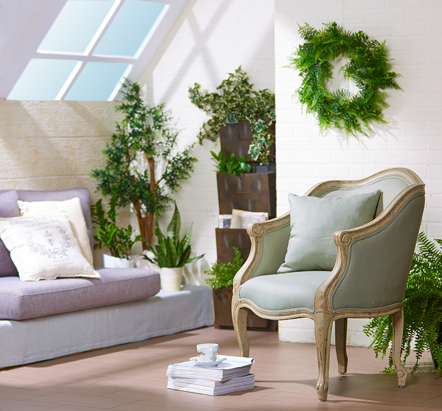
One of the really fun things of working in the studio is getting the chance to create places that may or (most likely) may not exist in real life. Recently we had a shot request that included the merchandise; a chair, a few fake plants, and a wall mounted shelf kind of thing that would normally hold magazines or something like that.
While looking for inspiration, my stylist (@cassi_bluebird) found an image that utilized an outside wall that leaned in at a 45 degree angle and the stylist and I felt that something like that would give our image that little something extra that we enjoyed introducing into our images.
We also realized that unlike normal room settings where you will most likely have more than one piece of furniture, this image would only feature one chair. Also, we normally like to have the background go as out of focus as possible (this puts the viewer’s focus on the merchandise) but for this shot, the background needed to be a bit more in focus as it would be where the plants and shelf would be.
One of the biggest challenges with room settings is that they not only need to feature the furniture, they also need to be believable, with lighting and accessories that would make sense as if it were actually in someone’s house or apartment.
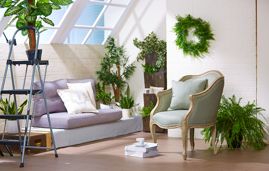
We decided to build a loft apartment, utilizing white brick walls along with one or two architectural details that would give our place the feeling that it was located in an older building, but on the top floor and one that had an abundance of natural light. We turned one of our portable walls on it’s side and used that as the base of the windows (made from 3/4′ foam core boards) which proceeded up at the aforementioned 45 degree angle. We also build a small nook in the corner of the room to give it that feel of the older building that usually has a few unusual corners or quirky built ins that you so often find in these sort of places.
Once we had the walls built and the windows “hung” from the ceiling, I started to light the interior. Wanting to obtain a bright, light feel I extended a bare bulb head as far above the windows as possible (this would be our main light or “sun” giving distinct shadows). Lens choice came down to an 85mm f/1.2 which I used almost wide open in order to give a bit of softness to the background (but enough focus to identify the other merchandise in the corner). A large softbox behind camera supplied fill light, and I kept it powered up pretty high in order to give good illumination to the shadows.
In the end, the shot turned out almost better than we had anticipated, and the merchants loved the image….especially the slanted window walls.
Thanx for tuning in!
Here is a uncropped shot showing a bit more of the set:


